
Our Master Bath Remodel! Before & After Photos
I'm so excited to reveal our gorgeous new master bath on the blog today! Let me start by saying my wish for remodeling our bathroom had been on my mind for about 10 years! 10 years ya'll! I put a lot of thought and heart into designing a space that I felt would stand the test of time, would be modern yet blend with the rest of our house and would create seamless function for two people living the dream and sharing a bathroom LOL. A lot of blood, sweat and tears were put into this remodel as we did much of the demo work ourselves. Here's a little video of my husband sawing the fiberglass shower unit into sections to get it out of the house. I literally filled 5 giant trash bags of insulation in the process!
I chose to GC the construction and hired/scheduled all the subs for the job. Overall it went pretty smoothly but I did learn a few very valuable lessons, like if you order tile online, UPS will drop it at your curb and wave goodbye. I really didn't think this part through. Of course they delivered all 2,000 pounds of marble on a freezing, rainy January night just as we were sitting down for dinner. We had to shlep it inside box by box, by box, by box. Not a shining star moment for me and my marriage!

Here are some before photos showing the former linen closet located between the commode and entrance door. Yes I could store a lot in there but it took up so much space in the overall floorplan I never liked it. The bath cabinet was at the old height of 30" and had hardly any storage. Between the paint color, 80's brass light fixture, the black grout lines in the tile and the fiberglass tub unit, it was long overdue for a remodel.
Determined to design the bath of my dreams, I began with a new and improved floorplan that would make the space feel much larger. To replace the linen closet, I designed a 90" long vanity with his and her sinks, a center drawer bank and a countertop cabinet for everyday items. I also eliminated the ceiling soffit over the original tub so the ceiling height was consistent throughout the bathroom. Lastly I designed a fabulously functional walk in shower with frameless glass doors.
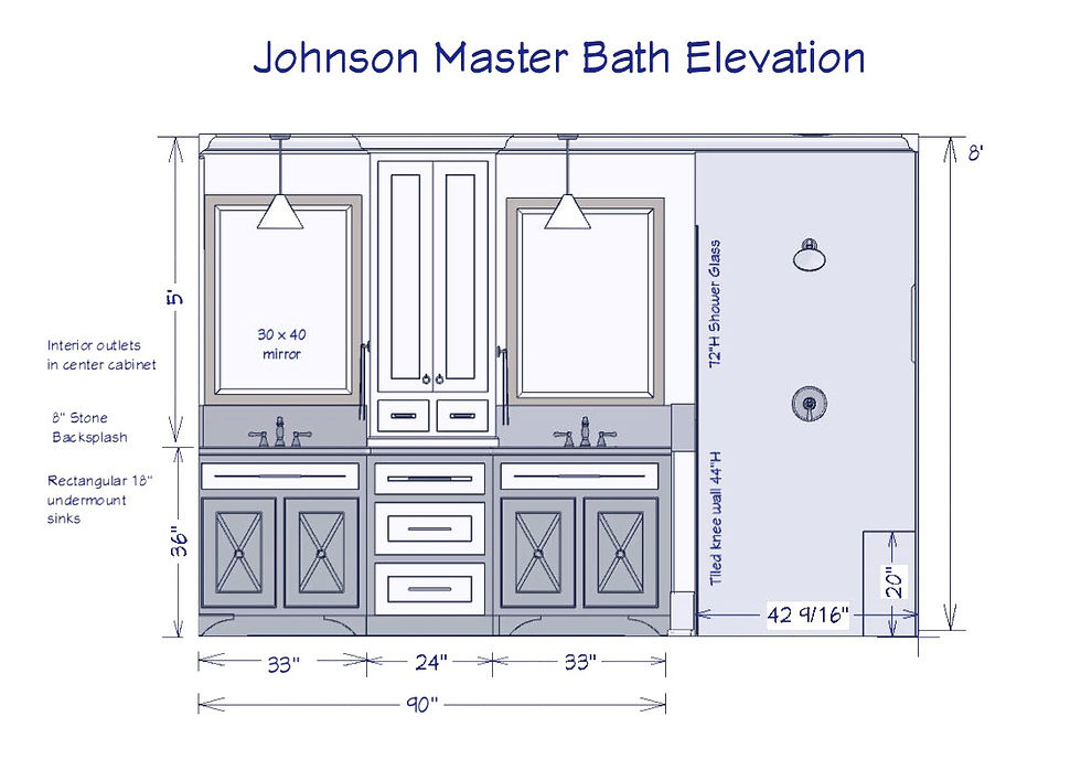
I absolutely love our new bath vanity! We have plenty of storage and with the center cabinet we keep the countertops clean! Hidden electrical outlets are included so items like electric toothbrushes and hairdryers stay out of sight. I adore the X-detail on the base cabinet doors and the hanging glass pendant lights. Originally I wanted antique brass plumbing fixtures but I wound up mixing metals and I'm happy with the end result. Another unique design detail is the 8" backsplash (usually 4") which creates a seamless fit with the knee/shower wall.

The hanging glass pendant lights are so airy and I love how they reflect in the mirrors. I made sure to put them on dimmer switches so I can create wonderful soft light when my eyes are tired. Below, I found this adorable cabinet at a local store and it fits perfectly for storing toiletries right next to the commode! I really wanted a little warm wood tone in there to offset the cool marble.

And last but not least is a shot of the new walk in shower! I chose a small herringbone pattern for the floor & shower niche and used a 4 x 8" tile for the shower walls. All of the marble in the bathroom is honed for a matte finish which I think adds character and is less slick to walk on. I added a little extra height to the glass doors to look proportionate with the counter to ceiling cabinet, mirrors and pendant lights. All of these details add height to the room drawing the eye up to make it feel larger.

The shower is nearly 4' wide and super spacious! We have 2 shower heads and the spray mount which has been great for washing my daughters hair on occasion. Every shower NEEDS a spot to assist in shaving legs and the corner seat is the perfect height. I included a stainless steel towel bar on the inside of the knee wall so it's really out of sight and is the perfect spot to hang wet washcloths. Another neat feature is the linear shower drain located at the back of the shower. It is a stainless steel tray that the herringbone tile pattern was carefully installed in so that it really blends in with the floor. No more staring down a yucky center shower drain!

I went for a light grey grout to blend with the tile and wall paint. Overall I am thrilled and in love with our new bath. It's where I begin and end every day. It really functions well when my husband and I are both using it because we have our own space to get ready in. I feel blessed to finally have my dream bathroom! If you would like to receive the design specs for the project (paint colors, cabinet colors, marble pattern, hardware, lights, shower drain, etc...) shoot me an email at hello@robinjohnsoninteriors.com and I will send them to you! Have a great weekend!


https://soicauxsmb.com/ hôm trước thấy bạn bè nhắc nhiều quá nên mình cũng bấm vào xem thử cho biết. Mình không có đọc sâu đâu, chủ yếu lướt nhanh xem họ làm giao diện ra sao thôi. Cảm giác đầu tiên là trang nhìn sáng sủa, không bị rối mắt, kéo xuống khá mượt. Mấy phần thông tin được chia thành từng khối riêng nên nhìn cái là biết đang ở đoạn nào, đỡ phải căng mắt dò. Mình cũng thích kiểu họ để dữ liệu theo dạng bảng/cột gọn gàng, nhìn qua là nắm được ý chính chứ không phải mở từng mục. Thanh menu để ngay chỗ dễ thấy nên chuyển qua lại cũng nhanh. Nói chung bố cục…
sunwin mình cũng chỉ ghé thử vì thấy mọi người nhắc hoài, kiểu tò mò xem trang trông ra sao thôi. Vào cái là thấy giao diện khá dễ chịu, không bị nhồi chữ hay rối mắt. Mình không có ngồi đọc kỹ từng thứ, chủ yếu lướt nhanh để xem họ bố trí có hợp lý không. Điểm mình thích là các mục được gom nhóm nhìn phát hiểu ngay, nên bấm qua lại cũng tiện, khỏi phải mò. Thông tin trên trang họ trình bày theo dạng khối rõ ràng, nhìn gọn và đỡ phải kéo xuống dài lê thê. Nói chung cảm giác như họ ưu tiên cho người mới vào khỏi bị “ngợp”, và cái menu…
Really liked how this post kept things simple and didn’t drag on with a bunch of extra jargon. It felt like someone explaining it the way they’d talk in a chat, so I could skim and still get the point. Halfway through I clicked around https://newimage.io/ out of curiosity, and it gave me the same kind of clean, no-drama feel—nothing shouting at you, just straightforward stuff. I’m not usually patient with messy pages, but this one (and that site) didn’t make me hunt for the important bits. The spacing and short chunks help a lot when you’re scrolling on a phone. Also, the headings are easy to spot and the layout stays tidy instead of turning into a wall of…
KUWIN mình mới ghé thử vì thấy bạn bè nhắc hoài, kiểu vào xem cho biết chứ không định ngồi lâu. Giao diện nhìn khá gọn, lướt một vòng là nắm được chỗ nào là tin tức, chỗ nào là phần hướng dẫn giải đáp nên đỡ phải mò menu. Mình có đọc ké mấy dòng FAQ thấy họ nói kết quả vận hành bằng RNG chuẩn quốc tế, nghe cũng đỡ lăn tăn hơn chút. Chuyển qua lại giữa các mục không bị giật hay rối mắt, chữ nghĩa trình bày dễ đọc. Nói chung cảm giác họ sắp xếp nội dung có trật tự, không nhồi nhét. Trên trang mình thấy hai khối “TIN TỨC” và “Hướng Dẫn…
https://tylekeopro.com/ dạo này thấy mọi người nhắc hoài nên mình cũng bấm vào xem thử cho biết, kiểu lướt nhanh chứ không ngồi đọc kỹ. Cảm giác đầu tiên là trang nhìn sáng sủa, bố cục thoáng nên không bị “ngợp” như nhiều site khác. Mình thích nhất là cách họ chia nội dung thành từng khối rõ ràng, kéo xuống một chút là biết mình đang ở phần nào luôn. Với lại thanh menu để khá dễ thấy, bấm qua lại mấy mục không phải căng mắt tìm, dùng kiểu nhẹ nhàng. Nói chung chỉ cần vậy là đủ để mình nhớ mặt giao diện rồi, vì các khối nội dung xếp gọn và menu nằm ngay chỗ dễ…