
Stylish Mudroom and Butler Pantry Powerhouse
Updated: Jan 13, 2020
I have to say this one of my all time favorite mudroom / butler pantry designs to date! My client Amy was so much fun to work with because we both love fun pops of bold color which we mixed with a vintage rustic style. Formerly an orange (eek!) laundry room with some basic lower cabinets and an off center sink, this room was the main family entrance into the home from the garage and into the kitchen. Needless to say, it was not an ideal spot to have dirty laundry and a washer and dryer running . We decided to move the laundry room into an adjacent guest bath and design a very functional and beautiful mudroom with a butler pantry for overflow kitchen use and storage.

Living in SC and being only one block of the beach, we wanted to include a coastal vibe. The room definitely has a tropical feel featuring colorful monkeys or more specially mandrills in a bold wallpaper on each end of the room. With large scale patterns like this, generally less is more, but because of the amount of cabinetry in our plan we went for it. Pretty much the entire room was designed around this inspirational wallpaper.

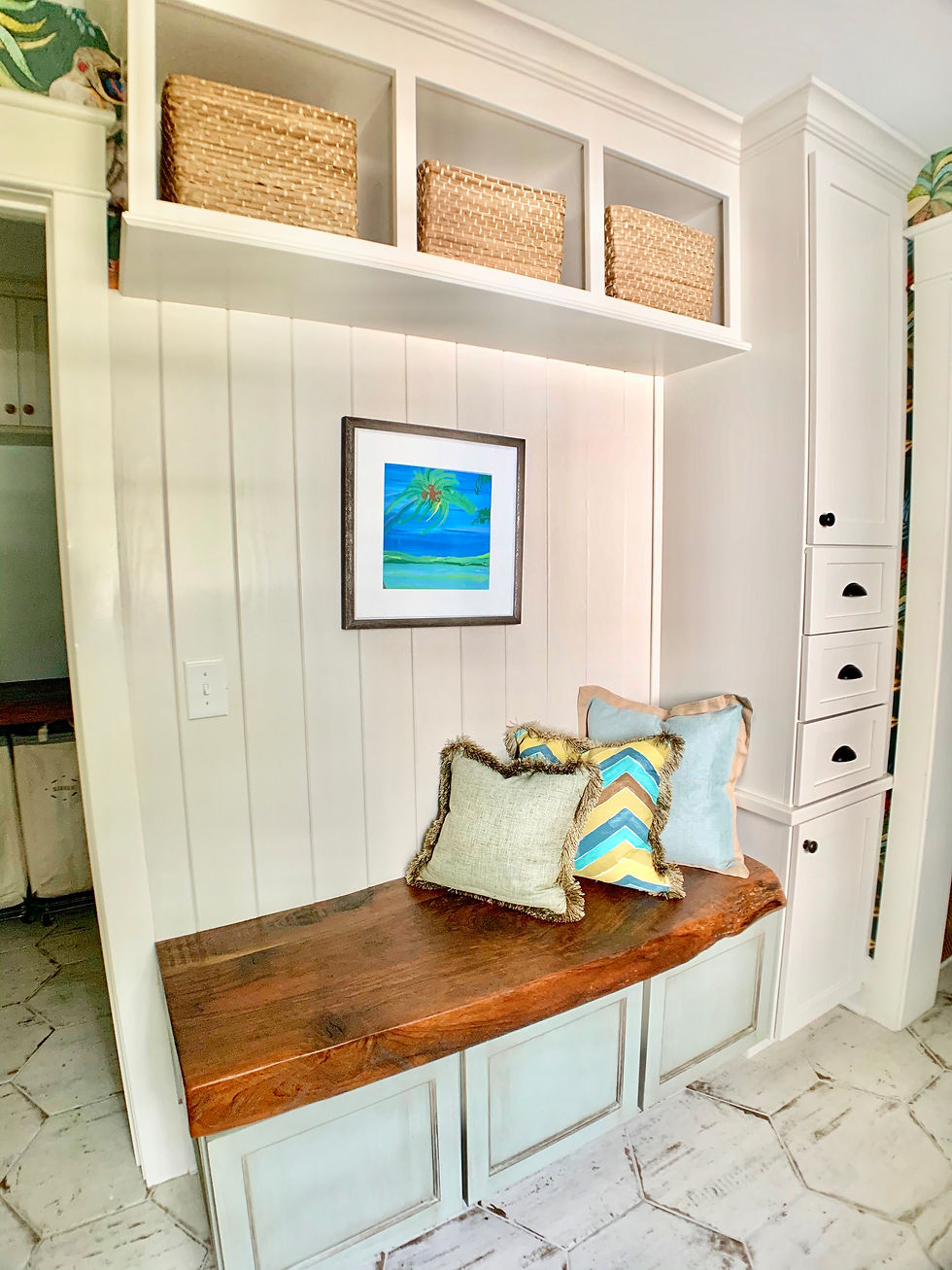
The mudroom "side" of the space includes distressed custom cabinetry with plenty of drawer storage and basket cubbies. Hanging wall hooks will eventually find their way onto the tongue and groove... Amy is enjoying the simplicity of the woodwork for now. The most notable feature is the live edge walnut bench seat that Amy repurposed from her family farm in Virginia. It really is stunning and brings a piece of history and nostalgia to the project.

The butler pantry "side" of the room also includes distressed custom cabinetry with plenty of storage. A few of the design details like decorative cabinet feet, seedy glass doors, an apron front farm sink, bead-board backsplash, bronze hardware & vintage light fixture all work together to create a custom vintage style. And definitely take a good look at the bronze sink faucet! Perfection!


You might also have noticed the hexagonal floor tile. We loved it because it is a graphic pattern with a worn, rustic finish. It looks to be painted and rubbed off to show the "wood" tones underneath. The larger size and scale of it works well with the crazy monkey wallpaper that we adore! Lol.

To see all the amazing photos of this project you can look on my website portfolio page under Litchfield Beach Remodel. As I am posting this project right before Thanksgiving, I am reminded how blessed and grateful I really am to do what I do and to work with such amazing people along the way. I will be posting an project interview with Amy soon so you can hear all about her experience working with me! If you would like to receive any of the design specs for the project (wallpaper, cabinet colors, tile, plumbing fixtures, hardware, lights, fabrics, etc...) shoot me an email at hello@robinjohnsoninteriors.com and I will send them to you! Have a great weekend!


xosoplus.mobi dạo này thấy bạn bè nhắc hoài nên mình cũng ghé thử cho biết, kiểu vào xem giao diện họ trình bày ra sao thôi. Vừa mở lên là thấy họ chia mục theo ngày khá rõ, có dòng XSMB ngày 19 07 2026 rồi kèm phần dự đoán cho 20 7 2026 nên khỏi phải đoán đang nói kỳ nào. Mình ưng nhất là cách họ để dữ liệu thành khối riêng, nhìn phát nhận ra ngay, đặc biệt cái bảng “Đầu lô tô Đuôi lô tô” để dạng cột nên lướt nhanh vẫn theo được mà không bị rối mắt. Nói chung cảm giác trang này ưu tiên cho người muốn nhìn số liệu gọn gàng, và…
https://keonhacai5.com/ mình ghé thử vì thấy bạn bè share, kiểu vào xem giao diện là chính. Ấn tượng đầu là trang chia khối nội dung khá gọn, nhìn lướt một vòng là biết đâu là bài nhận định, đâu là phần kèo/tỉ lệ, không bị dính vào nhau. Mình có đọc qua bài Girona vs Athletic Bilbao (03h00 ngày 05/11), tiêu đề để nổi nên khỏi phải tìm, kéo xuống là nội dung chia đoạn ngắn nên đọc đỡ mệt mắt. Mấy chỗ bảng kèo trình bày theo cột, spacing ổn nên liếc nhanh cũng nắm được ý. Nói chung cảm giác dùng khá “thoáng”, chuyển qua lại không bị lạc vì menu đặt dễ thấy và các heading phân…
hitclubvn.co.com mình thấy mọi người nhắc hoài nên cũng ghé thử cho biết. Mình không phải dân chơi gì đâu, chủ yếu xem giao diện với cách họ trình bày thông tin có dễ theo dõi không. Vào cái là thấy trang sắp xếp khá gọn, kiểu chia mục rõ ràng nên lướt nhanh vẫn nắm được nội dung đang nói về gì. Mình thích cái cảm giác bấm qua lại giữa các phần không bị khựng, chuyển trang khá mượt nên đỡ bực. Với lại chữ nghĩa nhìn ổn, không bị rối mắt, mấy đoạn giới thiệu để theo khối nên đọc nhanh hiểu nhanh. Nói chung không kỳ vọng nhiều mà thấy họ làm bố cục thân thiện,…
gavang tv dạo này mình thấy có người nhắc tới khi nói về các nền tảng giải trí trực tuyến nên cũng thử mở vào xem cách họ bố trí giao diện ra sao. Mình không đi sâu vào nội dung hay từng trò cụ thể, mà chủ yếu quan sát cách các chuyên mục được phân chia trên trang và cách thông tin hiển thị cho người dùng. Nhìn tổng thể thì các khu như thể thao, casino, game bài hay slot thường được sắp xếp theo từng nhóm khá rõ, hiển thị dạng khối và danh sách nên lướt qua cũng dễ theo dõi. Các bảng dữ liệu được trình bày dạng cột khá gọn, giúp quan sát…
hitclub com mình vô thử cho biết vì thấy bạn bè nhắc hoài, tưởng đâu kiểu web nặng nề ai ngờ mở lên cái là vào khá lẹ. Mình lướt sơ thôi chứ chưa chơi gì, chủ yếu xem giao diện với cách họ sắp nội dung. Cảm giác bấm qua lại mấy mục không bị đứng hay giật, dùng trên điện thoại cũng ổn nên đỡ bực. Mình thích nhất là họ để mấy khối thông tin quan trọng ngay đầu trang, nhìn phát là hiểu đại khái có gì chứ không phải kéo dài mới thấy. Chữ tiếng Việt đọc tự nhiên, menu đặt chỗ dễ thấy nên tìm cái cần xem cũng nhanh. Nói chung bố cục…